A logo is a visual representation of everything a business stands for, from its business to its brand image, and even associating the products & services with that logo. Whenever we speak about brand image of a business, the logo is the first thing that appears in our mind, which also implies that logo is an essential element that denotes a brand.
In reality, a logo enhances potential customers and partners’ first impression of a company. A good logo can build brand loyalty between a business and its clients, establishing a unique brand identity, and portraying professionalism of an established enterprise.
There is more to crafting a company’s logo than just placing a company’s name into a square and calling it a day. For those who are about to embark on a logo design journey, or think that it is time for a visual identity revamp, here are eight tips to create the perfect logo for your business.
Tip #1. Understanding Logo Types
Understanding the different logo types is important in determining the way your logo looks. There are three basic kinds of logos – iconic, logotype/wordmark, and combination mark.
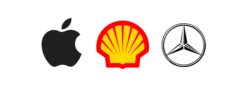
Iconic logos are compelling yet simple images that are representative of a particular company or product. In most cases, these images are abstract and stylized to give visual interest to their target audience. Apple, Shell, and Mercedes-Benz use iconic logos to represent their brands.
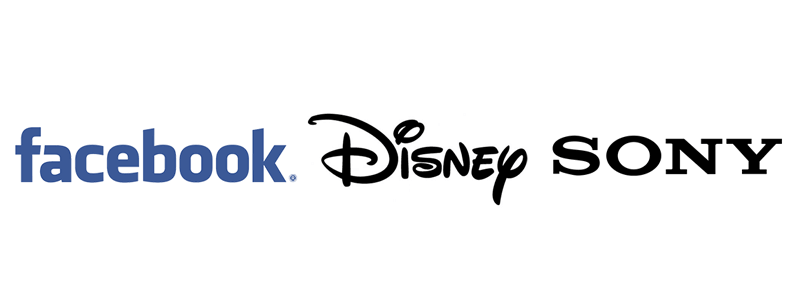
Logotype/Wordmark is a kind of logo that incorporates the business or brand name with type treatments and a twist to make them distinctive. With thousands of possible variations, shapes, sizes, and styles, the logo can convey a slightly different impression upon its target audience. Some companies that use this logotype include Facebook, Disney, and Sony.
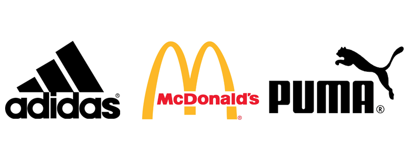
Combination Marks are logos that combine a wordmark and an icon to give the flexibility for business to use either or both elements across a variety of applications. A well-designed combination mark looks just as good with the elements separate as it does with them together. A few example of companies that use combination mark are Adidas, McDonald’s, and Puma.
Tip #2. Knowing What is an Effective Logo
An effective logo is distinctive, appropriate, practical, visually pleasing, simple and has the ability to convey an intended message. In basic terms, the logo must be able to fulfill the following:
- It must be simple for easy recognition and association, and it should not be overdrawn. At the same time, the simplicity of the logo is able to make it memorable for the intended audience.
- It must be enduring and ‘future proof’, meaning that it should still be relevant and effective in 10, 20, 50+ years time.
- It must be versatile and able to work across a variety of mediums and applications.
Tip #3. The Power of Colors
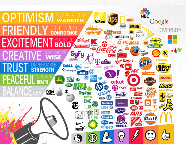
When designing a logo, it is vital to take into account the way people interpret color. Psychologists have studied how humans are affected by colors and found a high correlation between colors and emotional responses. Thus, choosing the right color is crucial in determining how your brand is viewed by the public.
For instance, fast-food restaurants like McDonalds, Pizza Hut, and KFC use red in their logos to stimulate hunger. While black, white, silver and gold are often employed in the logos of luxury brands like Prada, Chanel, Michael Kors, and others to enhance the feeling of sophistication.
Here is a bigger version of the color guide for logo.
Tip #4. Establish a Design Process
A design process is necessary because it helps to makes sure all stages are completed. Also, it contributes to ensuring that each phase will be completed in an amount of time agreed upon in the design brief. Every designer has his or her design process, and it is rarely linear, however here is a rough guide of a design process.
Design Brief – Complete a questionnaire or interview with the client to get the design brief and design requirements.
Research – Conduct research on the industry, its history, the brand, its competitors and best practices.
Reference – Conduct research on logo designs that have been successful and current trends that are related to the design brief.
Conceptualising – Develop logo concepts around the brief, research and references.
Reflection and Internal Feedback – Take breaks throughout the design process and allow your ideas to mature. Ask around internally, receive feedback and improve on your design.
Presentation and Improvements – Choose to present only a selected few logos to the client and get feedback. Repeat this process until the project is completed.
Tip #5. Knowing the Brand and Audience
One of the most important steps before developing the logo concept is to understand the brand – who they are, what they do and what is their demographic. The logo must reach a particular audience and when designing, you must keep this in mind. By understanding the brand and its intended audience, you can better craft your concept and drive the intended branding message more efficiently.
Tip #6. Mood Boards and Mind Mapping
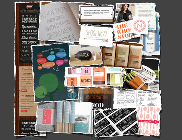
Creating a mood board with images that remind you of the brand’s ideology or a mind map with keywords about the brand can also help you straighten out your thoughts, mix up different imagery and ideas, and gather a multitude of inspirations from multiple sources.
Tip #7. Go Vector for Scalability
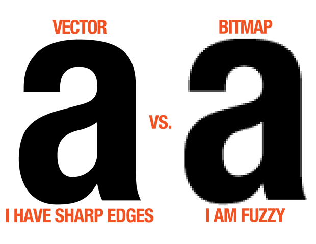
It is always best practice to design a logo in vector format. Every digital image falls into one of the two categories: a vector image, or a raster image. A raster image is made up of tiny dots called pixels, while a vector image is made up of lines. The value of a vector boils down to two parts: flexibility and scalability. Vector logos are flexible as they can be easily converted to just about any conventional raster image format like jpg or png. They are also scalable in size without jeopardizing the quality.
Producing a logo in vector format will save any pain and frustration with later iterations.
Tip #8. Create a Logo Style Guide
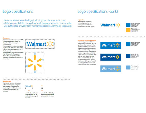
A logo style guide is a set of rules on how the logo should be visually presented to the public. These rules serve as a guide to correctly use and communicate a brand’s visual identity, by determining the way a logo can be used which includes color options, size restraints, positioning, typefaces and how the logo works on various backgrounds.
The logo style guide ensures consistency in branding and that the logo is presented at its best to its intended audience.
