Google is not your typical Internet company. As one of the most successful and innovative Internet company in the world today, their mission is to transform the world’s information to be universally accessible and useful.
Much like a teenager exploring on various identities, Google is determined to be more than just a search engine that they initially are recognized for. Over the past years, they have evolved in a lot of ways – from their products and services to the change of their look and feel. In fact, they can be considered as one of the trendsetters in the digital arena of our time.
Since its inception, Google.com has been extremely simple: The wacky, multicolored logo sits nicely on top of a single search bar on a clean white background. But as technology progresses, the canvas itself needs to evolve, and the expectations of users are becoming more diverse. New types of devices and ways for interaction and communication have surfaced with new technologies such as voice technology, smart devices, and wearables tech.
Early this year, after the announcement of Alphabet, Google has undergone some major restructuring and rebranding. This rebranding effort was made with the intention to create a new typeface to accommodate the company’s new direction. Making the logo look good on smaller screens is also one of the major considerations. The new, simpler lettering is supposed to scale better to smaller sizes, making the wordmark more distinct and easier to read.
Just like the previous logo, the new Google logo is still a wordmark, but using a sans-serif typeface, giving it a more modern and playful feel. The colors are also softer and gentle than they used to be. On closer look, the new logo does bear a bit of a resemblance to the logo of Google’s new parent company, Alphabet.
Here is what Google’s design team has to say about the new typeface:
In tandem with developing the logotype, we created a custom, geometric sans-serif typeface to complement the logo in product lockups and supporting identity materials. We call it Product Sans.
The typeface design takes cues from that same schoolbook letter-printing style, but adopts the neutral consistency we’ve all come to expect from a geometric sans serif. This allows us to maintain an appropriate level of distinction between the Google logotype and the product name.
The character set is complete with numerals, punctuation, accent and alternate characters, fractions, symbols, and supports extended Latin, Greek, and Cyrillic.
The Elements
Google Logotype
A sans serif logotype that retains our distinct multi-color sequence.
Dots
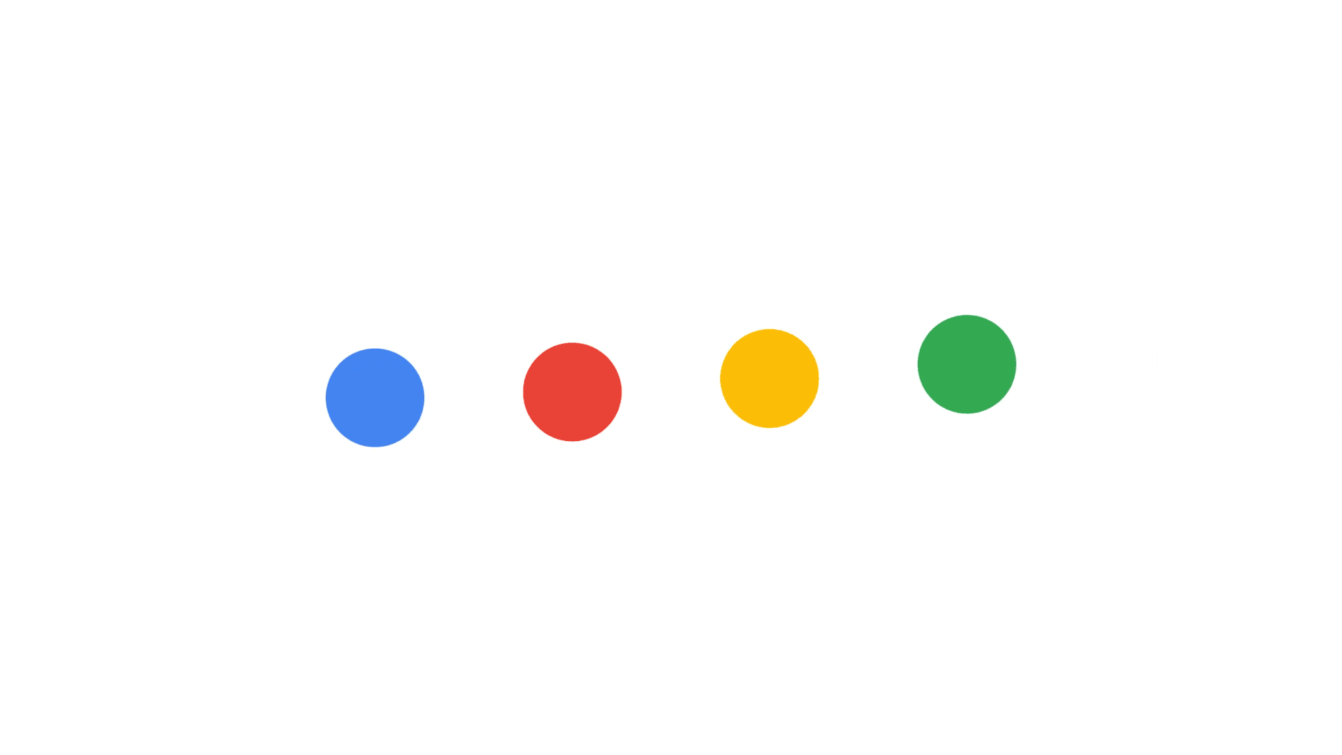
A dynamic distillation of the logotype for interactive, assistive, and transitional moments.
Google G

A compact version of the Google logo that works in small contexts.
This new branding change will find its way to all of Google’s products and services, with many vector-based variants created to satisfy any use case scenarios. Moving forward, this rebranding move by Google might also spark rebranding movements by other companies.


